Neutral colors are timeless, calming, and incredibly versatile. When used correctly, a neutral palette creates a clean, elegant, and sophisticated environment—without ever feeling boring or lifeless. Whether you’re going for a modern, rustic, minimalist, or classic look, neutrals provide the perfect foundation for any design style.
In this article, you’ll learn how to decorate your home using neutral colors in a way that feels warm, dynamic, and full of personality.
What Are Neutral Colors?
Neutrals are colors that lack strong saturation. Common examples include:
- White
- Cream
- Beige
- Gray
- Taupe
- Greige (a mix of gray and beige)
- Soft browns
- Charcoal
- Black (used in moderation as an anchor)
These shades work well on their own or as a base to highlight more vibrant tones.
1. Choose Your Base Tone (Warm or Cool)
Not all neutrals are the same. They can have warm or cool undertones, which affects how the space feels.
- Warm neutrals (beige, cream, taupe) make a room feel cozy and inviting
- Cool neutrals (gray, stone, icy whites) create a crisp, modern atmosphere
Choose one side and stay consistent throughout your space to maintain harmony.
Tip:
Use samples and observe them under natural and artificial light before committing—lighting dramatically affects how neutrals appear.
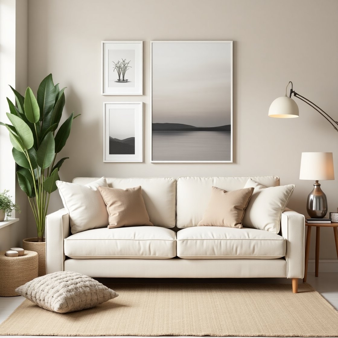
2. Layer Different Shades of the Same Color
One of the easiest ways to make a neutral room feel rich and textured is to layer multiple tones of the same color family.
For example:
- Combine white, ivory, and cream for a light, airy look
- Layer grays from pale silver to charcoal for a dramatic yet balanced space
- Use various beige tones for a warm and earthy feel
This subtle contrast keeps the space from feeling flat or dull.
3. Add Texture for Depth
When you’re working with a limited color palette, texture becomes essential. It adds dimension, interest, and warmth to your decor.
Incorporate different materials like:
- Linen curtains
- Woven rugs
- Leather or suede furniture
- Rattan or cane chairs
- Knitted or faux fur throws
- Textured wall art or plaster finishes
Combining soft, rough, matte, and glossy finishes helps create a multi-sensory experience in a neutral room.
4. Use Black or Dark Accents for Contrast
Adding a touch of black—or other deep shades like charcoal or espresso—creates contrast and sophistication in a neutral room.
Examples:
- Black picture frames or lighting fixtures
- A dark feature wall
- Dark metal hardware or faucets
- A charcoal sofa or accent chair
These elements “ground” the room and prevent it from feeling washed out.
5. Incorporate Natural Materials
Neutrals pair beautifully with natural elements, helping to bring warmth and a sense of calm to your space.
Try incorporating:
- Wooden furniture (light oak, walnut, or reclaimed wood)
- Stone or ceramic decor
- Plants in clay or neutral-toned pots
- Jute rugs or woven baskets
This adds an organic feel and reinforces the soothing effect of a neutral palette.
6. Play with Shapes and Lines
In a space where color is subtle, visual structure becomes more important. Use a variety of shapes and lines to create interest.
Ideas:
- Round mirrors or furniture to soften a room
- Linear artwork or grid-based gallery walls for structure
- Sculptural lighting or curved sofas for contrast
- Architectural details like wainscoting or molding
Different silhouettes keep the room visually dynamic even with minimal color.
7. Use Statement Pieces Sparingly
In a neutral room, one or two statement pieces can make a big impact without overwhelming the space.
Try:
- A large piece of art in neutral tones
- A unique light fixture
- An oversized plant
- A vintage chair or table that adds character
Statement elements shine brighter against a calm backdrop.
8. Don’t Be Afraid to Add Subtle Color
Neutral doesn’t mean colorless. You can incorporate subtle hues that behave like neutrals—muted greens, dusty pinks, soft blues, or terracotta.
These colors blend well into a neutral palette while adding warmth and personality.
9. Keep It Clean and Cohesive
A neutral palette demands a sense of order. Too much clutter or inconsistency can make it feel messy instead of peaceful.
Tips:
- Stick to 2–3 core tones throughout the home
- Use matching or coordinating accessories
- Hide cords, electronics, and visual noise
- Choose storage solutions that match your palette
A clutter-free, neutral space feels intentional and refined.
10. Balance Light and Dark Elements
Even within a neutral palette, contrast matters. Combine light walls with darker furniture, or vice versa, to create balance.
Example:
- White walls with a tan sofa and dark wood coffee table
- Beige walls with ivory furniture and black accents
- Pale gray walls with white bedding and charcoal pillows
A mix of light and dark creates layers, which give the room energy and sophistication.
Calm, Clean, and Timeless
A neutral color palette is more than a safe choice—it’s a timeless foundation for thoughtful, stylish living. It adapts easily to your evolving taste, and when layered with intention, it’s far from boring.
Remember:
- Choose warm or cool neutrals and stick to one direction
- Use texture, shape, and materials to add depth
- Incorporate contrast with dark accents
- Layer shades and subtle colors for variation
- Keep it clean, cohesive, and uncluttered
Neutral doesn’t mean plain—it means peaceful, polished, and endlessly adaptable.