Choosing the right color palette for a room is one of the most important design decisions you can make. Colors influence mood, energy, and even how spacious or cozy a room feels. A carefully chosen palette brings harmony, balance, and style—while a poor one can make even a well-furnished space feel awkward.
Whether you’re decorating from scratch or just refreshing your space, this guide will help you confidently select colors that reflect your personality and complement your home’s aesthetic.
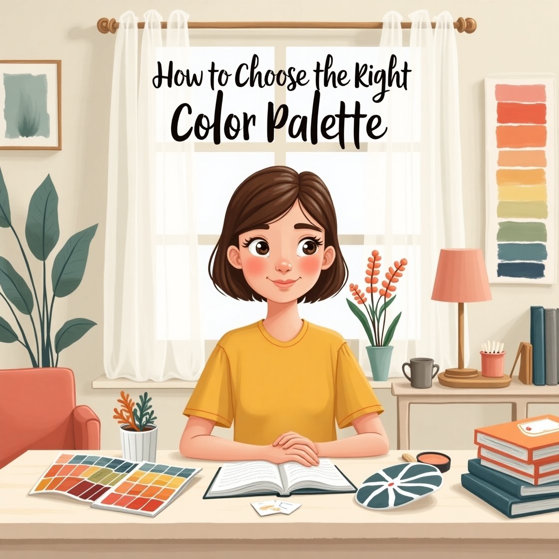
Why the Color Palette Matters
Colors have a psychological impact, and they directly affect how we feel in a space. For example:
- Blues create calm and relaxation
- Greens bring freshness and balance
- Yellows add warmth and energy
- Grays and neutrals create elegance and flexibility
- Dark tones can feel cozy or dramatic
- Brights add vibrancy and playfulness
Understanding how color affects a room allows you to design intentionally, not just by trend.
1. Start with the Mood You Want to Create
Before picking any color, define how you want the room to feel. Ask yourself:
- Do I want this space to feel relaxing or energizing?
- Should it feel formal or casual?
- Bright and airy or warm and cozy?
This emotional direction helps guide your color choices. For example:
- Bedrooms typically benefit from soft, soothing hues like light blues or muted greens.
- Kitchens and dining areas can feel lively with warm yellows or earthy tones.
- Living rooms often use neutral bases with pops of color for comfort and versatility.
2. Use the 60-30-10 Rule
This classic design principle helps you balance colors effectively in any space.
- 60% – Dominant color (usually walls or large furniture)
- 30% – Secondary color (accent furniture, rugs, curtains)
- 10% – Accent color (pillows, decor, artwork)
This approach ensures your room doesn’t feel too busy or chaotic. It also makes experimenting with bolder shades feel safer.
Example:
- 60% Light Gray (walls and large sofa)
- 30% Navy Blue (rug and curtains)
- 10% Mustard Yellow (pillows and artwork)
3. Draw Inspiration from an Object You Love
If you’re unsure where to start, take inspiration from something you already love—a patterned cushion, a favorite artwork, or even a rug.
Use the colors in that item to build your palette. For example:
- Pick the background color as your base
- Pull out a bold detail color as your accent
- Use a supporting shade as your secondary color
This method guarantees a palette you’re already drawn to and ensures cohesion with your existing decor.
4. Consider the Room’s Lighting
Lighting can drastically affect how colors appear:
- Natural light shows the truest color
- Incandescent light warms up colors (especially reds, oranges, and yellows)
- Fluorescent light adds a cooler tone (making blues and greens pop more)
Always test paint swatches at different times of day before committing. What looks beige in daylight may appear yellow under warm bulbs.
5. Choose a Color Temperature
Colors have “temperatures” that can influence the atmosphere:
- Cool colors: blues, greens, purples – calming, spacious, and crisp
- Warm colors: reds, oranges, yellows – energizing, cozy, and stimulating
- Neutral tones: beiges, whites, grays – flexible and grounding
Mixing warm and cool tones can work beautifully if balanced properly, but sticking to one “temperature” often creates a more harmonious effect.
6. Test with Digital Tools and Samples
Before committing, use apps or digital design tools to experiment with combinations. Many brands (like Sherwin-Williams, Benjamin Moore, or Behr) offer online visualizers.
Also:
- Get sample pots and paint small sections of the wall
- Try peel-and-stick color swatches
- Observe them in natural and artificial light over a few days
These steps prevent costly mistakes and ensure satisfaction with your choices.
7. Use Neutrals as a Foundation
If bold colors feel overwhelming, start with a neutral base. Whites, grays, and beiges provide a timeless foundation that allows accent colors to shine.
You can always layer color in through:
- Artwork
- Textiles
- Furniture
- Decorative accessories
Neutrals keep things elegant, especially in smaller spaces or if your style changes over time.
8. Embrace Contrast—Carefully
Contrast adds energy and visual interest to a room. You can achieve this with:
- Light vs. dark (e.g., white walls with a dark navy sofa)
- Warm vs. cool tones (e.g., warm wood with cool gray walls)
- Matte vs. glossy finishes (e.g., matte wall paint with a shiny tile backsplash)
However, too much contrast can feel chaotic. Aim for one or two strong contrasts and balance the rest with subtler tones.
9. Take Cues from Nature
Nature offers some of the most harmonious and beautiful color palettes:
- Ocean themes: soft blues, whites, sandy beige
- Forest tones: greens, browns, and mossy grays
- Desert shades: warm rust, terracotta, and earthy neutrals
- Floral inspiration: pinks, greens, and lavender tones
Using these natural palettes creates an effortlessly grounded and timeless look.
10. Stay Consistent Throughout the Home
Each room doesn’t need to be the same color, but having a consistent palette throughout your home creates flow and cohesion.
Ways to do this:
- Use the same undertones (cool or warm) in every room
- Repeat accent colors in different ways (e.g., navy pillow in the living room, navy vase in the hallway)
- Choose one neutral base color and build from there
This strategy makes transitions from room to room feel smooth and intentional.
Color Your Space with Confidence
Choosing the right color palette is a creative and empowering process. It sets the tone for your space, reflects your personality, and brings your vision to life. By following a few foundational principles—like starting with mood, balancing with the 60-30-10 rule, and testing your picks—you can design a space that feels just right.
Trust your instincts, stay curious, and don’t be afraid to play with color. With the right palette, your home will not only look amazing—it will feel amazing too.